Of Heaven and Hell
Once upon a time, a historical mystery writer penned a rather ghoulish tale set in a dark, ancient crypt and strewn with dead priests and mummified corpses and all manner of nasty secrets. She called her tale What Hell Marks, after a favorite Shakespearian quote. She sent if off to her publishing house, along with what she thought was a great suggestion for a cover, including a menacing arch, a worn staircase, a glimpse of the skirt of a woman running away, and a skull.
Her publishing house said, “You know how we talked about doing something to make this series attract more female readers?”
To which our writer nervously replied, “Yes….”
“Well, we think women would be put off by a book with ‘hell’ in the title. So we’re changing it to What Remains of Heaven.”
Our writer attempted to demur, but The Powers That Be prevailed. (Unless your name is Grisham or King, The Powers That Be nearly always prevail.) Our writer was unhappy, but she’s been in this business long enough to know that she needs to roll with the punches. Then the cover arrived. (Cue screams of horror.)
Unfortunately, our writer is prevented by The Powers That Be from showing you this original version. But let me describe it for you: Drift back in time to the 1960s, when Gothics were all the rage. Got that mindset? Good. Now, picture a woman, barefoot, wearing only a white corset and a petticoat (complete with bare shoulders, heaving bosom, and bare back showing through the lacings of the corset) running up dark castle-like steps wrapped in an ethereal light. Think Sarah Jessica Parker in a corset and torn petticoat being chased by a ghost. You may suspect I am exaggerating. Believe me, I wish I were.
Our author takes one look at this cover and nearly swoons. She frantically calls her agent. She emails her publishing house. She is reminded, not so subtly, that her name is not Grisham or King. She is told, “The marketing department LIKES the cover. We said we wanted to do something to make this series appeal more to female readers, remember?” (Cue death knell in the distance.)
Our author weeps. She pleads. She says, “But it looks like a romance! And it is NOT. Don’t you think this cover sends a false message? This book is strewn with dead bodies.” She is told a new cover would be prohibitively EXPENSIVE. She says, “Can you maybe cut the woman off at the waist so all we see is her skirts?” No. “Then at least photoshop it to make the corset and petticoat a color, and get rid of the bareback seen through the lacing and add sleeves so that it looks like a dress? And put shoes on her feet? And get rid of the paranormal-like lighting effects? And maybe add a skull at the base of stairs? And, and…”
After much grumbling, she receives a new version, and a warning: This is it. Like it or lump it. Alas, our author is lumping it (whatever that means), and crossing her fingers that this cover won’t put off every male reader (and non-romance reading female reader) that her series has.
The cover just went up on Amazon, and already our author has received this comment from a reader named Chen: “Is that really the cover? Or is that a "stand-in" until a cover is finalized? I'm hoping it's the latter. Otherwise it gives it too much of a "romance novel" feel. I am really enjoying this series and I guess I'd like to see the book have just the right look… I hope that's not the final cover.”
Alas, Chen; that’s the final cover. Believe me, I feel your pain. Times a million. I try to console myself with the thought that at least it's no longer Sarah Jessica Parker in a corset being chased by a ghost.
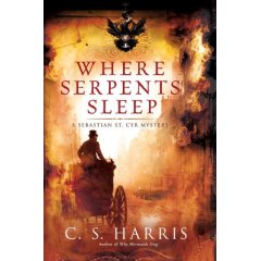
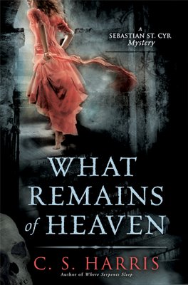
So, without further ado, here it is:
Her publishing house said, “You know how we talked about doing something to make this series attract more female readers?”
To which our writer nervously replied, “Yes….”
“Well, we think women would be put off by a book with ‘hell’ in the title. So we’re changing it to What Remains of Heaven.”
Our writer attempted to demur, but The Powers That Be prevailed. (Unless your name is Grisham or King, The Powers That Be nearly always prevail.) Our writer was unhappy, but she’s been in this business long enough to know that she needs to roll with the punches. Then the cover arrived. (Cue screams of horror.)
Unfortunately, our writer is prevented by The Powers That Be from showing you this original version. But let me describe it for you: Drift back in time to the 1960s, when Gothics were all the rage. Got that mindset? Good. Now, picture a woman, barefoot, wearing only a white corset and a petticoat (complete with bare shoulders, heaving bosom, and bare back showing through the lacings of the corset) running up dark castle-like steps wrapped in an ethereal light. Think Sarah Jessica Parker in a corset and torn petticoat being chased by a ghost. You may suspect I am exaggerating. Believe me, I wish I were.
Our author takes one look at this cover and nearly swoons. She frantically calls her agent. She emails her publishing house. She is reminded, not so subtly, that her name is not Grisham or King. She is told, “The marketing department LIKES the cover. We said we wanted to do something to make this series appeal more to female readers, remember?” (Cue death knell in the distance.)
Our author weeps. She pleads. She says, “But it looks like a romance! And it is NOT. Don’t you think this cover sends a false message? This book is strewn with dead bodies.” She is told a new cover would be prohibitively EXPENSIVE. She says, “Can you maybe cut the woman off at the waist so all we see is her skirts?” No. “Then at least photoshop it to make the corset and petticoat a color, and get rid of the bareback seen through the lacing and add sleeves so that it looks like a dress? And put shoes on her feet? And get rid of the paranormal-like lighting effects? And maybe add a skull at the base of stairs? And, and…”
After much grumbling, she receives a new version, and a warning: This is it. Like it or lump it. Alas, our author is lumping it (whatever that means), and crossing her fingers that this cover won’t put off every male reader (and non-romance reading female reader) that her series has.
The cover just went up on Amazon, and already our author has received this comment from a reader named Chen: “Is that really the cover? Or is that a "stand-in" until a cover is finalized? I'm hoping it's the latter. Otherwise it gives it too much of a "romance novel" feel. I am really enjoying this series and I guess I'd like to see the book have just the right look… I hope that's not the final cover.”
Alas, Chen; that’s the final cover. Believe me, I feel your pain. Times a million. I try to console myself with the thought that at least it's no longer Sarah Jessica Parker in a corset being chased by a ghost.
So, without further ado, here it is:

Labels: covers, publishing industry
posted by cs harris at 11:44 AM
23 comments
links to this post
![]()
![]()